


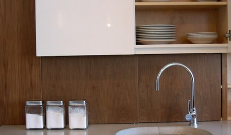
Love this kitchen - Had to share
redroze
14 years ago

Sort by:Oldest
Comments (37)
Related Stories
KITCHEN WORKBOOK8 Kitchen Amenities You'll Really Wish You Had
Keep kitchen mayhem and muck to a minimum with these terrific organizers and other time-saving, mess-preventing features
Full Story
If the Black Swan Had Different Sets....
Design Eye on the Oscars: What If Nina Had More Symmetry and Better Light?
Full Story
LIFEYou Said It: ‘I Knew This Home Had to Be Mine’ and More Quotables
Design advice, inspiration and observations that struck a chord this week
Full Story
TASTEMAKERSPro Chefs Dish on Kitchens: Michael Symon Shares His Tastes
What does an Iron Chef go for in kitchen layout, appliances and lighting? Find out here
Full Story
KITCHEN DESIGNA Designer Shares Her Kitchen-Remodel Wish List
As part of a whole-house renovation, she’s making her dream list of kitchen amenities. What are your must-have features?
Full StoryFEEL-GOOD HOMESimple Pleasures: Share Supper in the Kitchen
Gather friends but leave the stress behind with a casual kitchen meal that still feels special
Full Story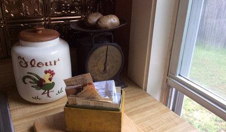
KITCHEN DESIGN5 Home Cooks Share Their Favorite Family Recipes
Peek inside the kitchens of these Houzz users and learn how to cook their time-tested, passed-down dishes
Full Story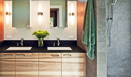
BATHROOM DESIGNA Designer Shares Her Master-Bathroom Wish List
She's planning her own renovation and daydreaming about what to include. What amenities are must-haves in your remodel or new build?
Full Story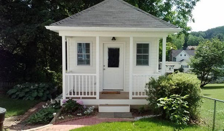
STUDIOS AND WORKSHOPSCreative Houzz Users Share Their ‘She Sheds’
Much thought, creativity and love goes into creating small places of your own
Full Story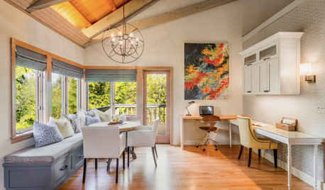
DECORATING GUIDESRoom of the Day: Breakfast Room Shares Space With Home Office
An inviting area for casual family meals with his-and-her desks offers beauty and functionality
Full StorySponsored
Columbus Area's Luxury Design Build Firm | 17x Best of Houzz Winner!
More Discussions


malhgold
rubyfig
Related Professionals
Frankfort Kitchen & Bathroom Designers · Forest Hill Kitchen & Bathroom Remodelers · Apex Kitchen & Bathroom Remodelers · Fort Pierce Kitchen & Bathroom Remodelers · Glen Allen Kitchen & Bathroom Remodelers · Lakeside Kitchen & Bathroom Remodelers · Lisle Kitchen & Bathroom Remodelers · Saint Augustine Kitchen & Bathroom Remodelers · Princeton Kitchen & Bathroom Remodelers · Vermillion Cabinets & Cabinetry · Wadsworth Cabinets & Cabinetry · Warr Acres Cabinets & Cabinetry · Watauga Cabinets & Cabinetry · Green Valley Tile and Stone Contractors · Pacific Grove Design-Build Firmstkln
jakkom
beekeeperswife
cat_mom
redrozeOriginal Author
redrozeOriginal Author
laurap_2007
megradek
lyno
beekeeperswife
jeanteach
kateskouros
gsciencechick
friedajune
southernstitcher
segbrown
redrozeOriginal Author
lesmis
antss
polie
gbsim1
kateskouros
kompy
redrozeOriginal Author
kompy
antss
qs777
rmkitchen
polie
redrozeOriginal Author
erikanh
qs777
Gena Hooper
redrozeOriginal Author
dilzy