


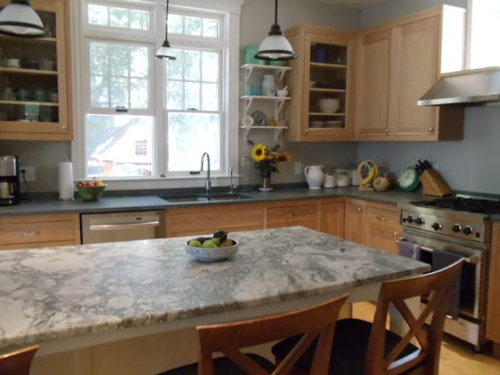
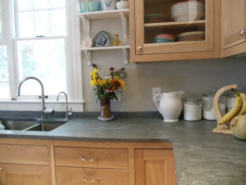
Now cooking - nearly complete birch and painted kitchen
13 years ago


Featured Answer
Sort by:Oldest
Comments (27)
 13 years ago
- 13 years ago
Related Professionals
Albany Kitchen & Bathroom Designers · Soledad Kitchen & Bathroom Designers · Fullerton Kitchen & Bathroom Remodelers · Eureka Kitchen & Bathroom Remodelers · Kuna Kitchen & Bathroom Remodelers · Sun Valley Kitchen & Bathroom Remodelers · Thonotosassa Kitchen & Bathroom Remodelers · York Kitchen & Bathroom Remodelers · Christiansburg Cabinets & Cabinetry · Hopkinsville Cabinets & Cabinetry · Jefferson Valley-Yorktown Cabinets & Cabinetry · National City Cabinets & Cabinetry · Central Cabinets & Cabinetry · Oak Hills Design-Build Firms · Shady Hills Design-Build Firms- 13 years ago
- 13 years ago
- 13 years ago
- 13 years ago
- 13 years ago
- 13 years ago
- 13 years ago
- 13 years ago
 13 years ago
- 13 years ago
 13 years ago
- 13 years ago
- 13 years ago
- 13 years ago
- 13 years ago
- 13 years ago
- 13 years ago
- 13 years ago
- 13 years ago
- 13 years ago
- 13 years ago
- 13 years ago
- 13 years ago
- 13 years ago
Related Stories
DECORATING GUIDESHow to Love Your Kitchen More, Right Now
Make small changes to increase the joy in your kitchen while you cook and bake, without shelling out lots of dough
Full Story
KITCHEN DESIGNBirch Plywood Keeps Things Light in a Cotswolds Kitchen
A country kitchen is packed with clever design details — including an island on wheels — that give it a modern yet natural look
Full Story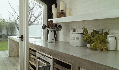
KITCHEN COUNTERTOPSKitchen Counters: Concrete, the Nearly Indestructible Option
Infinitely customizable and with an amazingly long life span, concrete countertops are an excellent option for any kitchen
Full Story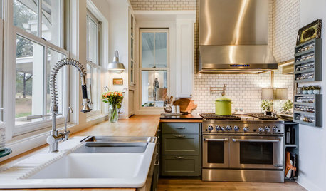
DECORATING GUIDES25 Design Trends Coming to Homes Near You in 2016
From black stainless steel appliances to outdoor fabrics used indoors, these design ideas will be gaining steam in the new year
Full Story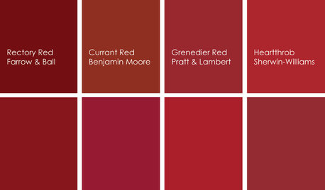
KITCHEN DESIGNCooking With Color: When to Use Red in the Kitchen
Candy Apple Red, Red Licorice and more for your kitchen walls, cabinets or island? The color choices are as delicious as they sound
Full Story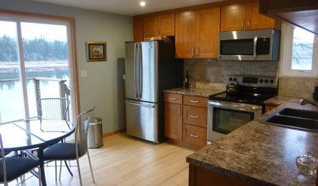
KITCHEN MAKEOVERSSee a Kitchen Refresh for $11,000
Budget materials, some DIY spirit and a little help from a friend turn an impractical kitchen into a waterfront workhorse
Full Story
KITCHEN DESIGN9 Ideas Coming to a Kitchen Near You
2012 kitchen updates: Tall, solid-surface backsplashes, smarter storage, handy task stations and sheen instead of shine
Full Story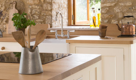
KITCHEN DESIGNHistoric Stone Barn Now a Country Farmhouse Kitchen
A designer carves out a cooking and dining space while carefully preserving the protected 17th-century structure
Full Story
KITCHEN DESIGNTrending Now: 25 Kitchen Photos Houzzers Can’t Get Enough Of
Use the kitchens that have been added to the most ideabooks in the last few months to inspire your dream project
Full Story
KITCHEN DESIGNA Cook’s 6 Tips for Buying Kitchen Appliances
An avid home chef answers tricky questions about choosing the right oven, stovetop, vent hood and more
Full Story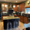

cat_mom