


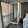
Lenox Tan samples in my house
msrose
13 years ago
Related Stories
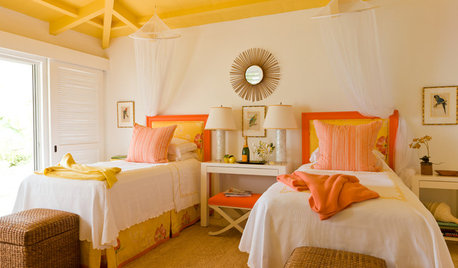
DECORATING GUIDESPaint Color Ideas: 7 Bright Ways With Yellow and Orange
Go with the glow. These sample palettes and room examples show you how to work with two of the happiest hues around
Full Story
DECORATING GUIDESColor of the Week: Decorating With Warm Gray
Tired of tan? Getting gloomy from cool gray? Make warm gray your new go-to neutral
Full Story
SELLING YOUR HOUSEKitchen Ideas: 8 Ways to Prep for Resale
Some key updates to your kitchen will help you sell your house. Here’s what you need to know
Full Story
SELLING YOUR HOUSE10 Ways to Boost Your Home's Resale Value
Figure out which renovations will pay off, and you'll have more money in your pocket when that 'Sold' sign is hung
Full Story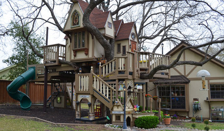
MOST POPULARThe Most Incredible Kids' Tree House You'll Ever See?
Duck your head to enter this unforgettable Dallas wonderwork, lovingly crafted with imaginative delights
Full Story
FEEL-GOOD HOME9 Ways to Boost Your Home’s Appeal for Less Than $75
Whether you’re selling your home or just looking to freshen it up, check out these inexpensive ways to transform it
Full Story
SELLING YOUR HOUSEThe Latest Info on Renovating Your Home to Sell
Pro advice about where to put your remodeling dollars for success in selling your home
Full Story
SELLING YOUR HOUSEHome Staging to Sell: The Latest Techniques That Really Work
Get up to speed on the best ways to appeal to potential buyers through accessories, furniture, colors and more
Full Story
COLORPick-a-Paint Help: How to Create a Whole-House Color Palette
Don't be daunted. With these strategies, building a cohesive palette for your entire home is less difficult than it seems
Full Story
LANDSCAPE DESIGNHow to Make Your Painted or Stained House Feel at Home in the Landscape
Use color and texture to create a pleasing connection between your house and garden
Full StorySponsored
Custom Craftsmanship & Construction Solutions in Franklin County
More Discussions


dawn_t
msroseOriginal Author
Related Professionals
Bel Air North Interior Designers & Decorators · Bronx Furniture & Accessories · Redmond Furniture & Accessories · Simpsonville Furniture & Accessories · Duluth Furniture & Accessories · Crofton Furniture & Accessories · Lake Arrowhead Furniture & Accessories · Mundelein Furniture & Accessories · Temple Terrace Furniture & Accessories · Immokalee Custom Artists · Pembroke Custom Artists · Saint Petersburg Lighting · Venice Lighting · Campbell Window Treatments · Seattle Window TreatmentsKathleen McGuire
msroseOriginal Author
momto4boys
Kathleen McGuire
boysrus2
msroseOriginal Author
User
User
msroseOriginal Author
User
haley_comet
User
luvnlife_09
Kathleen McGuire
msroseOriginal Author
User
msroseOriginal Author
User
msroseOriginal Author
Kathleen McGuire
elle3
luv2look
msroseOriginal Author
haley_comet
dawn_t
haley_comet
nancyr
peytonroad
msroseOriginal Author
msroseOriginal Author
nancyr
haley_comet
msroseOriginal Author
haley_comet
User
msroseOriginal Author
casal
Kathleen McGuire
msroseOriginal Author
karoloke
loribee
User
msroseOriginal Author
User
msroseOriginal Author
tfm1134
msroseOriginal Author
karoloke